Brassimo website redesign
Aims and Objectives
I worked with Bravissimo to help redesign their online e-commerce experience as part of a small delivery team at Brighton digital agency Clearleft. The retailer has high street stores at a number of locations throughout the country and one of their main selling points is their in store customer experience. Unfortunately this experience wasn’t being reflected on their website which, although has healthy traffic and sales, was dull, functional and tired. As a result the site didn’t reflect the retailers brand values so they required a bold redesign that they could be proud of which would make them stand out from their competitors.
The retailer had also noticed an increase in mobile traffic and wanted to improve the experience for their customers by having a fully responsive website and they wanted to learn from us so that they could take on further design and development work in house.
The final challenge was to develop a pattern library which was able to cover the needs of retailers two brands which are both served by the same site but which sell different products.
My role within this project was to lead the UX. This involved stakeholder management, research and UX design work, presenting it back to the client and working with the team at Clearleft.
Method
Discovery Phase
As with most large projects I undertake the first stage was to immerse myself in the subject and find out as much about the buying experience as I could.
Field Research
I really wanted to know more about the in store shopping experience from not only the clients shops but also that of their competitors. What makes a good experience for a woman buying lingerie?
I learn’t quite early on from informal chats to female friends that what separates the stores is not just the range of products and sizes but also the advice you get as a customer. To understand this more I set out with my partner to get bra fittings in all of the major department stores and specialist shops in the local area.
I noticed early on that there was a marked difference between the approaches from traditional department stores and specialist retailers like my client. The traditional approach on fittings from department stores was very much about the authority figure dictating the size and style and the approach from the specialist retailer is much more friendly and about finding what product feels right for the customer.
Competitor Analysis
Following on from the field research I was interested to find out more about how lingerie retailers sell their products online and how that compared to the in store experience.
The more traditional department stores had very traditional websites which mirrored the way they talked to customers in their shops. I was therefore surprised to find that none of the newer, specialist retailers hadn’t really capitalised on what they were offering in their shops and had chosen to develop very traditional, functional websites with none of the friendly customer service traits from the shops being reflected online.
Stakeholder Interviews
Once the initial market place research had been completed the next step was to talk to the various stakeholders to find out more about their needs and expectations for the new site.
Quite often in initial kickoff meetings with other clients I hear a lot about a desire for bold approaches to design and this was something I was keen to explore further with the group. We had a series of one to one and group workshop exercises where we went into depth about this and it was interesting to hear some agreement about certain aspects of the website but also the conflicting ideas within the company about how to take it forward.
Usability Testing
The final part of the discovery phase of the project was to talk to existing customers and also women who maybe customers in the future. The testing was part interview and also part to uncover what issues lie within the existing website.
Within the interviews I was interested in find out what the triggers and touch points were when women buy new underwear. Following on from this I wanted to see how their buying habits translated to the website through testing the main buying user journey customers go through.
Throughout the project I conducted more rounds of testing as the designs developed.
Card Sort
I conducted a card sorting exercise for both brands websites early on in the project. The reasons for doing this were to understand how customers naturally grouped the product range and also to gain insight into customers understanding of the labelling used to describe the clients products. The findings of this testing helped inform the new IA that was to be used on the site.

Interaction Design
Although we were building a pattern library and not the full site it was still important to chunk the project up into design sprints with regular playback and planning sessions as with a traditional Scrum based approach to development.
Sprints helped us as a team focus on the key areas of the site and allowed the client to remain in control of the direction of the project.
We explored several initial approaches to the design for the new site with the client. These designs ranged from more traditional e-commerce page layouts to more adventurous designs and followed a user journey from the homepage through to the product page and then on through the purchasing journey. The designs were based on feedback from the testing and were tested and iterated upon until we settled on a design which matched the clients needs and expectations and was liked and understood by the people in the usability tests.
I tried to make sure that the designs were not only usable and functional but also reflected some of the clients customer service through language, tone of voice and the advice and guidance that it gives to customers not familiar with the brand or its sizing.

Design Testing
I’ve used Bipolar Emotional Response Testing (BERT) in the past and found it gave some useful insights but wasn’t always an essential part of the user feedback loop. This time around I tied it in a lot closer with the branding work that the client had been doing with another agency. I took words from the clients brand mood boards and used them as a scale to benchmark the visual designs that had been done against the existing web page designs. These comparison tests were done as part of the usability testing and showed that the new visual designs were moving more in line with the clients brand aspirations.

Pattern Library
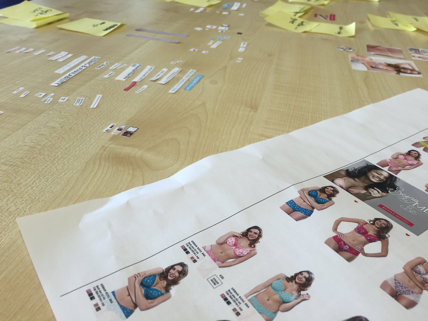
The final stage of the project was to start assembling a pattern library for the client to use when they build the site. My wireframes had been given a visual treatment and then were ready to be developed into reusable code.
We did this as a group exercise with the development team at the Clients office getting them to cut up the various page elements from paper print outs and then go through the process of collating similar patterns and also agreeing on naming conventions for each group before they were turned into code.
Outcomes
The redesign project I was part of is one element of a larger redesign project that the client is undertaking. So far the client has been very positive about the work that has been done by myself and the team at Clearleft.